Create a documentation quality bubble chart in Excel
Introduction
You have collated data about your documentation’s quality scores, traffic, and other information. You would like a way to quickly visualise the data and find documents that differ significantly from typical patterns, for example unusually long, complex, or infrequently viewed documents.
This guide shows you how to build a bubble scatter plot that highlights documentation outliers using reading time, sentence length, and page views.
The chart helps answer questions like:
-
Are outliers high-traffic pages?
-
Do popular pages have quality problems?
-
Which pages need a rewrite?
-
Can any pages be archived?
What you will build
The bubble chart you create in this guide will look similar to the following example.
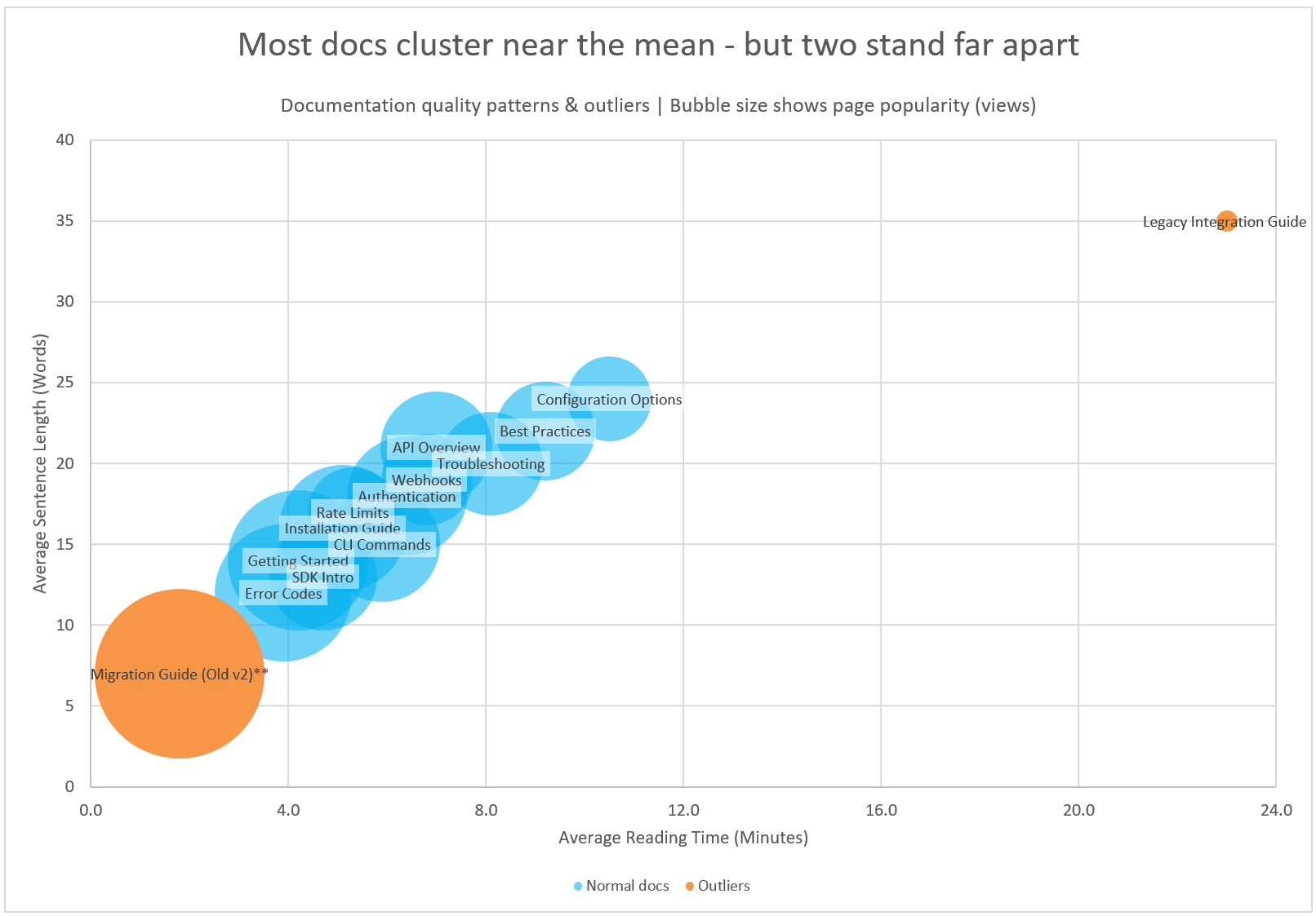
For an explanation of what this chart communicates, see Understanding Documentation Quality Bubble Charts.
Step 1: Download the file
Download and open the Microsoft Excel workbook. The workbook contains only one worksheet called Bubble Chart.
The sheet includes two data tables with sample quality data. Table 1 lists normal documents (not outliers). Table 2 lists outliers only.
Step 2: Format the data
Format the data so Excel recognises your tables as structured data.
-
Select the Normal Docs table.
-
In the Home ribbon, select Format as Table.
-
Create another table in your worksheet for your outlier documentation quality data.
-
Select the Outliers table.
-
In the Home ribbon, select Format as Table.
Step 3: Add your chart
-
Select the three numeric columns in the normal documents table: Reading Time, Sentence Length, Views (no headers).
-
In the Insert ribbon, select Charts. Then select X Y (Scatter) followed by the Bubble chart.
The chart is added to your worksheet. It has one series (Normal Docs).
-
Right-click the chart and select Select Data.
-
Select Add to add a new series.
-
Enter
Outliersin the Series name field. -
Select the Reading Time column (Outliers table, no headers) in the Series X values field.
-
Select the Sentence Length column (Outliers table, no headers) in the Series Y values field.
-
Select the Views column (Outliers table, no headers) for the Series Bubble Size field.
-
-
Select
Series1and choose Edit. EnterNormal Docsin the Series name field. Select OK. -
Select OK, then select OK again.
-
Drag the chart to increase its size.
Step 4: Format the chart
Add a Chart Title and Subtitle
-
Click the current title and rename it to something insightful for the audience, like Most docs cluster near the mean - but two stand far apart.
-
Add a subtitle Bubble size shows page popularity (views) so users will understand what the bubble size represents.
-
Increase the font size of the title and decrease the font size of the subtitle.
Add a legend
-
Click the chart.
-
Select the
+icon to open Chart Elements. -
Tick Legend and choose Bottom for the position.
Add Axis Titles and format Axes
-
Click the
+icon to open Chart Elements and tick Axis Titles. -
Click the x-axis title and rename it to Average Sentence Length (Words).
-
Click the y-axis title and rename it to Average Reading Time (Minutes).
-
Increase the font size of the axis titles and axis values.
-
Right-click the x-axis and select Format Axis. Change the Minimum value to
0. -
Right-click the y-axis and select Format Axis. Change the Maximum value to
40.
Adjust the bubble colours and labels
-
Make the Normal Docs series bubbles blue and set transparency to 30%.
-
Right-click a bubble.
-
Select Fill Color → choose blue.
-
Select More Fill Colors to adjust transparency.
-
-
Make the Outliers series bubbles orange using the same method.
-
Add document names to the bubbles.
-
Right-click a bubble in the Normal Docs series and select Add Data Labels.
-
Right-click again and select Format Data Labels.
-
Tick Value From Cells.
-
Select the column containing the document names.
-
Clear the Y Value and X Value checkboxes.
-
Set the label position to Center.
-
-
Make the document names stand out.
-
Right-click the data labels and choose Fill then More Fill Colours.
-
Select a white fill and set the transparency to 50%. Select OK.
-
Conclusion
You now have a bubble chart that visualises documentation quality patterns and highlights outlier pages.
This chart helps you quickly identify documents that are unusually long, complex, or low quality relative to the rest of your content set.
To continue building your documentation metrics toolkit, you can also create:
-
A content freshness treemap
-
A documentation complexity heatmap
-
A workload waterfall chart
These visuals complement the bubble chart and help you prioritise updates, rewrites, and content strategy decisions.