Understanding Documentation Quality Bubble Charts
A documentation quality bubble chart can turn raw content metrics into an immediate, visual story about the health of your documentation.
For a guide on how to create this chart, see Create a Documentation Quality Bubble Chart in Excel.
What this chart communicates
Core cluster
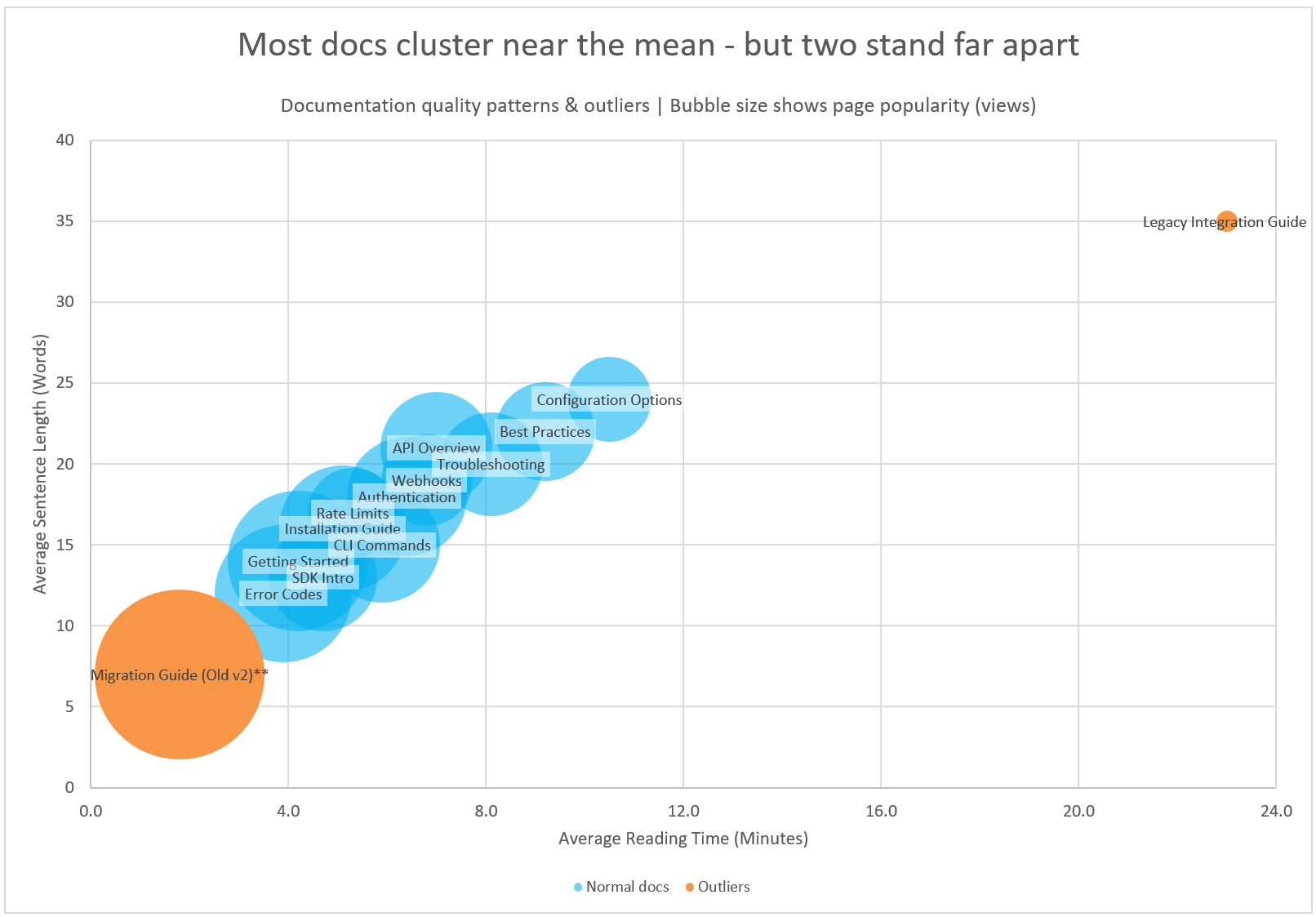
The blue cluster shows the “steady state” documentation set - pages that sit within normal ranges for length, complexity, and traffic.
Where users actually go
Bubble size shows page popularity. Large bubbles indicate high-value pages that users rely on. Small bubbles highlight low-visibility or low-impact content.
Where your attention is needed most
This visualisation surfaces two categories of outliers that typically signal opportunity or risk:
High-effort, low-value content: A long, complex legacy integration guide with minimal traffic may be outdated and consuming unnecessary maintenance effort.
High-traffic, low-quality content: A short migration guide with unusually high views may indicate gaps that frustrate users or drive support load.
Why this matters
This chart gives you a fast way to identify documentation that:
-
requires strategic updates
-
poses user-experience risk
-
delivers little return on effort
-
can be archived or consolidated
-
deserves investment because users depend on it
It turns raw documentation metrics into actionable priorities for your team.